top of page

+
addon
Redesigning the experience for personalized nutrition through AI-driven data
OVERVIEW
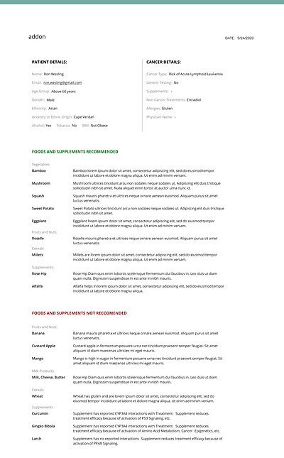
addon is a technology that provides online, on-demand, accessible, and evidence-based personalized nutritional care for the cancer care continuum - on treatment, in supportive care, or at genetic/familial risk. We ease the challenge of finding the right foods and supplements customized to your condition and genetic composition to strengthen immunity and reduce the risk.
PROBLEM
The website saw few conversion rates, less engagement, and a lack of awareness for the need of the product - personalized nutrition for cancer
SOLUTION
Re-assess UX strategy through design research, improve user flow and simplify UX content to clarify purpose and need for the product
Simplicity
I wanted to focus on keeping the design straightforward and simple to empathize with the anxious state of mind of the users. This meant clear call-to-action buttons leading to on-boarding, rearranging the hierarchy in the matter of importance - who is this for, why you need it, and what is the scope of the product. The simple step by step UI limits the decisions a user has to make.
Build Trust
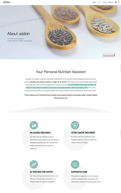
Designed the final product to have scientific explanations for every suggestion made. It also includes a recipe feature to increase engagement. I focussed on convincing and encouraging tonality throughout the website experience leading up to the purchase of the product. Designed the About page to have a section about the team and who is behind addon. The UX flow was re-designed to account for different stages of cancer care and all the possible targeted users.
Clarify Purpose
The insight from the research showed that there was not enough awareness or understanding of personalized nutrition. The purpose of addon's existence was getting lost under poor information flow. I made important decisions about converging 6 webpages into 3. This reduced UX steps and proved to help with clarity. The site is Iive and shown a 60% improvement in engagement and retention. We are now working on making this mobile responsive

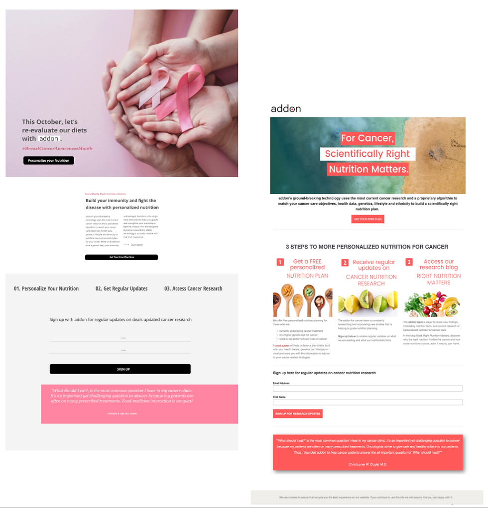
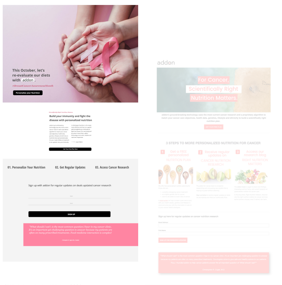
From that..
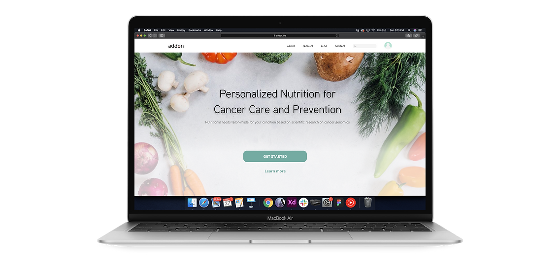

To this!

DESIGN PROCESS
Stage
1
Empathize:
- User Research
- Survey
- Journey Mapping
- Competitive Analysis
Stage
2
Define + Prototype:
- Synthesis
- Ideating Options
- Mid-Fi Prototyping
- Final Design Handoff
Stage
3
Test + Iterate:
- Mobile Screens
- A/B Testing
- Identifying Leads
- Iteration
STAGE 1: EMPATHIZE
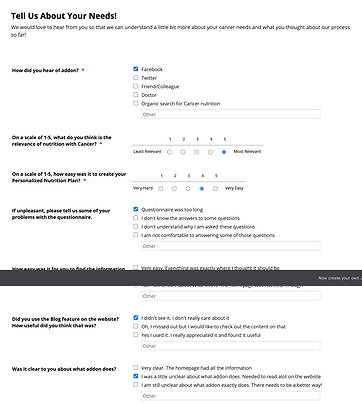
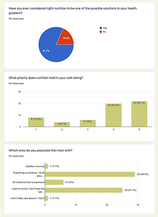
2 Surveys:
-
Learning about addon's existing flow
-
Most popular opinion - Unclear about what addon exactly does + didn't notice important features like the blog.
-
Understanding the relationship users have with their nutrition - functionally and emotionally.
-
Most popular opinion - Constantly thinking about nutrition is too much hassle.
User Interviews:
These are quotes from users who either have a condition or are at genetic risk. We wanted to understand the general feeling people have about taking up Nutritional Therapy
"It would be helpful to know what to exactly eat and how"
Potential User - SF, 38yrs
"I don't feel confident about the information I find on the internet. ...it's too contradicting"
Confused User - SF, 30yrs
"It is too big a commitment. I need more proof to be convinced"
Skeptic User - LA, 54yrs
Journey Mapping:
An average of the participants' journey who took nutritional therapy while undergoing treatment for a health condition - the first few days and after a few weeks into the journey prove to be the hardest. This example is representational of a couple of interviews conducted with those who were successfully able to reach the post-recovery stage of nutritional therapy.

Nutritional on-boarding and in-process being the hardest.
STAGE 2: DEFINE + PROTOTYPE
Synthesis:
Highlighted below were the identified problem areas and opportunities for improvement:
1. The current flow is not proven to be engaging enough due to a lack of structure
2. Users are not sure what to expect from free trials - resulting in low conversion
3. Users don't feel very convinced about making changes
4. General notion around nutrition is coming across as cumbersome

1.
The current experience is fragmented and lacks structure in the flow. Fails to predict anticipation.
There is a lack of trust in the information. The language and tonality does not seem to convince users.
2.
The product fails to deliver an engaging experience.
3.
OPPORTUNITY
OPPORTUNITY
OPPORTUNITY
Simplify and streamline UX flow, navigation and information
Position research strategically - Reassess UX writing
Enhance engagement through aesthetic, human-centric UI
Identifying tangible problems with the existing flow:
Based off the research, I went back to the board to identify the problems in the current interaction

Simplyfying and streamlining:
Process of simplifying the UX task flow and reducing the number of steps

STAGE 3: TEST + ITERATE
Human-Centric UI:
Ad campaigns were run on Facebook as form of A/B Testing to understand traction:
Humanistic, disease-fighting UI (left) caught more attention than nutrition centric UI (right)
1/2
Decision Making:
Reducing the navigation for users and bringing our the target audience upfront - all accessible from the home (landing) page was the goal

Target Audience:
Aiming to highlight the targetted audience of the product. The existing flow was known to leave the users in ambiguity.

Cancer
Treatment
Cancer
Remission
Genetic
Risk
Supportive
Care
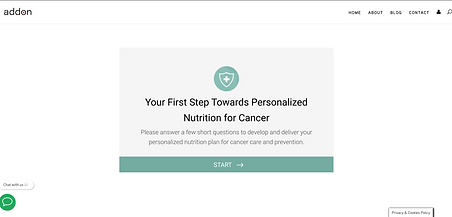
Final Flow:
CTAs on home page that take users directly to on-boarding or to learn more details about the product without much navigation hassle as it was earlier. Also, worked in the capacity of a UX Writer to address the tonality and empathy.


LEARNINGS AND REFLECTION
Working in a start-up environment was different - the roles and responsibilities I assumed were of a PM, Researcher, and a Designer. It was very interesting to understand the founder's vision and perspective for the growth of the product. I also delved deeper into strategizing content and UX writing. While I did get a chance to talk to a few cancer patients, it would have helped to speak to some more doctors and caregivers, and understand their concerns. However, the website saw a 20% increase in traction rate by the time I completed my time with them.

bottom of page